scale employed in statistics, news at 11

Via Say Uncle, I came across a post at feces flinging monkey regarding this graph published by the Bureau of Justice Statistics:

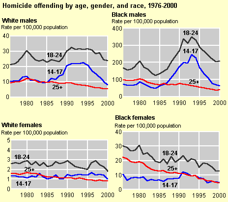
It’s deceptive, according to him/her, because the numbers of the vertical axis “don’t line up”. Yes, it’s called “scale”, and without it, the point of the data presented would be lost. The point, in case you missed it, as feces flinging monkey obviously did, is clearly stated in the title, “Dramatic increases in both homicide victimization and offending rates were experienced by young males, particularly young black males, in the late 1980’s and early 1990’s”

He follows up with:

This is a big part of the story. Let’s all just cut the crap and be honest about what we are dealing with here.

Okay. Cut what crap? Where’s the dishonesty? What are we dealing with?


Comments

I think also you may be missing that the white chart contains numbers in the tens whereas the black char contains numbers in the 100s.

I suspect the point is that it looks like the spike in black males is just above the level for white males, because lots of people are just going to skim over and not notice the order of magnitude difference in the scales. But, um, whatever.

No, I caught that. I can read graphs.

It’s called scale. The graphs weren’t meant to compare absolute numbers. They were comparing the change.

It’s called scale. The graphs weren’t meant to compare absolute numbers. They were comparing the change.

Then you would agree that to truly be scaled, the enlargement of the black folks’ graph would have to be bigger?

Uh, no, I wouldn’t. The graphs are shown as evidence that the rates for each group were increasing. Thus, they are presented at a scale that best fits the trend for each.

Why is that hard to understand? What do you think they were being deceptive about? What is the information you believe is being withheld or misrepresented?

Yeah, but, it’s right there. On the y-axis. labelled.

And, the scale wasn’t relevant to the point being made. The change was.

Well, I’d say the change was relevant to the people who made the graph in the first place, but to the people who are complaining about the differing scales, the point is probably “a whole lot more black guys kill folks than white guys, even if the numbers for black guys move around” or something like that. I have to say the original graphs don’t bug me, either.

the point is probably “a whole lot more black guys kill folks than white guys, even if the numbers for black guys move around” or something like that.

Ah, but even that’s not true. By the numbers, black people commit more homicides only as a function of their population (which are the numbers shown). Don’t get me wrong – I am not downplaying this. The number of black homicides as a percentage of their population is staggering, and it’s a crisis. But a key graph on that same page that flingingfecesmonkey conveniently didn’t mention is the one showing the graph of black homicidal victim rates, which is just as skewed.

The urban minority underclass is imploding.

I don’t beleive anything is being misrepresented but i think the real story is that violent crime is ten times higher based on race.

Indeed, that is a real story, and has been for years.

Thanks! Your comment has been submitted and will appear shortly.


Leave a comment